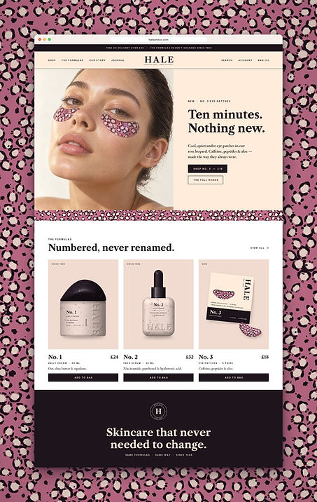
HALE & CO.
Nothing to prove. Nothing to fix.
A concept heritage skincare label: numbered formulas that are never renamed, a rose-leopard pattern and a palette lifted from old apothecary labels.
Self-initiated concept · Concept, identity, packaging and art direction by Mary Dawodu.
The Brief
Placeholder — replace with the brief. Give a quiet, unshowy skincare label a system that feels inherited rather than invented — one that could sit unchanged on a shelf for decades.
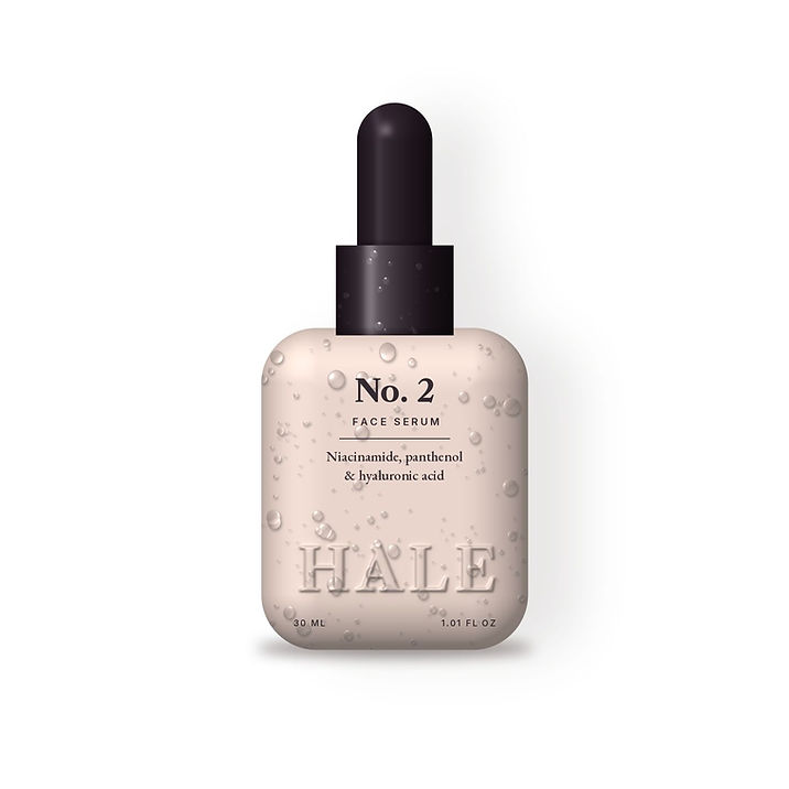
The Idea
Placeholder — replace with the idea. The formula never needed to change; the brand just needed to remember it. So the identity is written as a concept heritage brand, as if it has existed since 1989 — a fictional story told with total conviction.
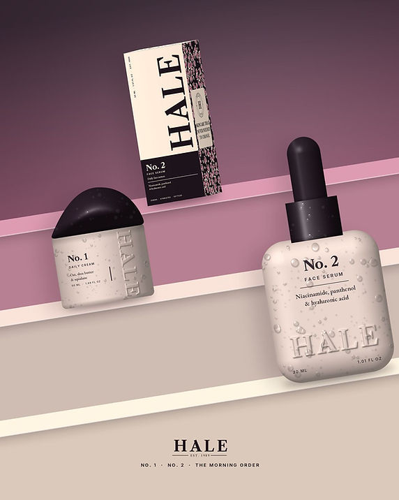
The World
Placeholder — replace with the references. Numbered formulas, a rose-leopard pattern and an antique palette: Licorice, Hale Rose, Hale Blush and Antique White.
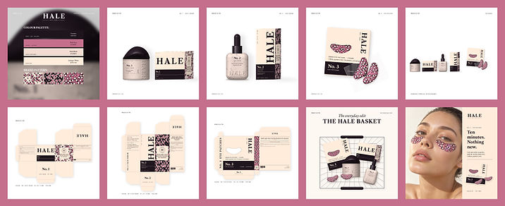
Identity
Placeholder — replace with the identity decision. A small-caps wordmark, a numbered naming system that never renames a product, and a mark that repeats softly across packaging.
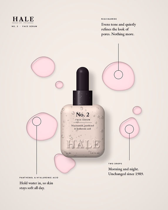
Packaging
Placeholder — replace with the packaging detail. Annotated dielines, a label spread for the No.2 serum, and a pattern that scales from carton to campaign without losing its rhythm.

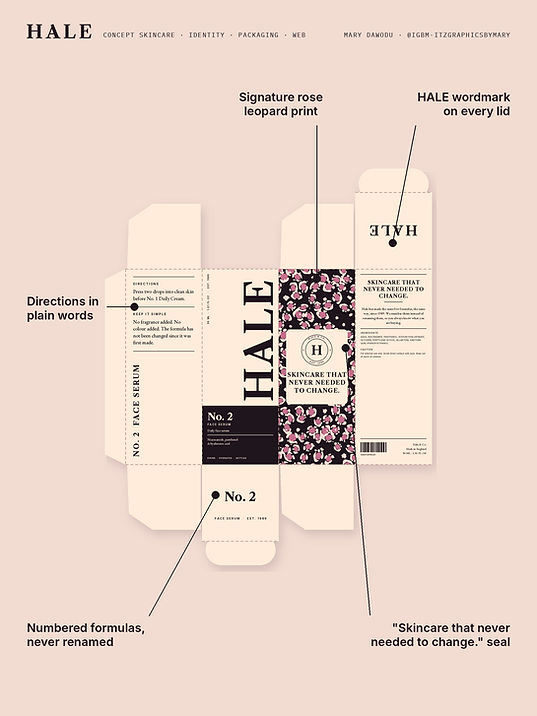
Campaign
Placeholder — replace with the campaign direction. The Morning Order: a still-life series that treats skincare as ritual rather than science.

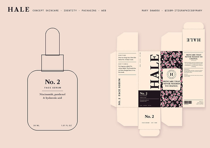
Final Outcome
Placeholder — replace with what was delivered. A complete range system: three products, one pattern, one palette and print-ready artwork.
HALE & CO. is a self-initiated concept project — a fictional brand world, not a real product for sale.